Responsive Images
When including images on mobile-friendly pages one must remember that things over 320 pixels wide may force sideways scrolling, and things over 160 pixels wide may take up over half the width. Also images which are large measured in bytes may take a long time to download over poor 3G connections.
One can readily force the browser to rescale an image. This has the advantage that the user can choose to zoom in, and at this point sees the extra detail. It is a good idea to use rescaling ratios which are simple decimals and fractions whose numerator and denominator are small integers, e.g. 0.8, 0.75, 0.6, 0.5, 0.4.
One should also remember that on a mobile device there will be several physical pixels to a reported CSS pixel. It is therefore very reasonable to supply a mobile device with greater resolution than the size specified in the HTML. For instance, with the recommended viewport setting, the iPhone 3, 4 and 5 will have twice the physical resolution of their "CSS" resolution, therefore will give the best quality if asked to scale a 200x200 pixel image to 100x100, for that would be no scaling at all in terms of physical pixels.
One can force the browser to crop an image. This wastes the other part of the image which will be transmitted, but never seen.
If one wishes to use JavaScript, or some slightly nasty CSS hacks, one can also simply serve a different image for different resolutions.
A rescaling example
In CSS:
img#pict1 {width: 200px; height: 260px;}
@media only screen and (max-width: 600px) {
  img#pict1 {width: 150px; height: 195px;}
}
@media only screen and (max-width: 400px) {
  img#pict1 {width: 100px; height: 130px;}
}
And the image itself:
<img id="pict1" src="jam_pot.jpg" style="float: left; margin: 5px;"
 alt="jam pot"/>
This produces:
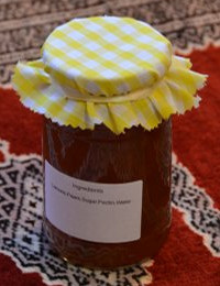
A Jam Pot, which shrinks once one's browser window is under 600 pixels wide, and again at 400 pixels wide, but will show the full detail if zommed. Note that one can add additional CSS to the img tag, which will be combined with that given by the CSS id.
A truncating example
In CSS:
div#pict2 {border-width: 0px;}
@media only screen and (max-width: 600px) {
  div#pict2 {border-width: 0px; max-width: 40px; overflow: hidden;}
}
And the image itself:
<div id="pict2">
<img src="cantab_500.gif" width="213" height="42" alt="Cambridge Logo"/>
</div>
This produces:
This image gets truncated once the window width is less than 600 pixels.
Continuous resizing
Possible, but barely comprehensible. These examples resize continuously at one quarter of the page width and up to a maximum of their natural sizes. Their aspect ratios are maintained, but not precisely hard coded.